- The High Low And Closing Prices For Microsoft Stock Over The Last Month Are Shown In The Cell Below The Date Is Days B 1 (37.5 KiB) Viewed 70 times
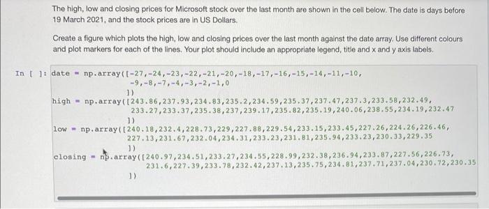
The high, low and closing prices for Microsoft stock over the last month are shown in the cell below. The date is days before 19 March 2021, and the stock prices are in US Dollars. Create a figure which plots the high, low and closing prices over the last month against the date array. Use different colours and plot markers for each of the lines. Your plot should include an appropriate legend, title and x and y axis labels. In [ ]: date - np.array([-27,-24,-23, -22,-21,-20,-18,-17,-16, -15,-14,-11,-10, -9,-8,-7,-4,-3,-2,-1,0 1) high = np.array(1243.86,237.93,234.83,235.2,234.59,235.37, 237.47,237.3,233.58,232.49, 233.27,233.37,235.38, 237,239.17,235.82,235.19,240.06,238.55,234.19,232.47 1) low - np.array([240.18,232.4,228.73,229,227.88,229.54,233.15,233.45,227.26,224.26,226.46, 227.13,231.67,232.04,234.31,233.23, 231.81,235.94,233.23,230.33,229.35 1) closing-n.array([240.97,234.51,233.27,234.55,228.99,232.38,236.94,233.87,227.56,226.73, 231.6,227.39,233.78,232.42,237.13,235.75,234.81,237.71,237.04,230.72,230.35 1)