- The Following Graph Shows The Demand Curve For A Group Of Consumers In The U S Market Blue Line For Laptops The Mark 1 (98.1 KiB) Viewed 100 times
- The Following Graph Shows The Demand Curve For A Group Of Consumers In The U S Market Blue Line For Laptops The Mark 2 (61.45 KiB) Viewed 100 times
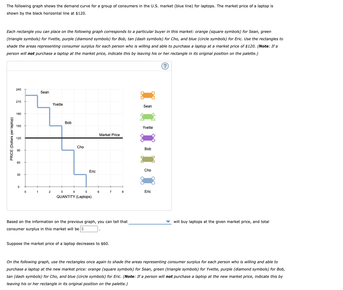
The following graph shows the demand curve for a group of consumers in the U.S. market (blue line) for laptops. The market price of a laptop is shown by the black horizontal line at $120. Each rectangle you can place on the following graph corresponds to a particular buyer in this market: orange (square symbols) for Sean, green (triangle symbols) for Yvette, purple (diamond symbols) for Bob, tan (dash symbols) for Cho, and blue (circle symbols) for Eric. Use the rectangles to shade the areas representing consumer surplus for each person who is willing and able to purchase a laptop at a market price of $120. (Note: If a person will not purchase a laptop at the market price, indicate this by leaving his or her rectangle in its original position on the palette.) (? 240 Sean 210 Yvette Sean 180 Bob 150 Yvette Market Price PRICE (Dollars per laptop) 120 Cho 90 Bob 60 Eric Cho 30 0 0 1 2 5 6 7 8 Eric 3 4 QUANTITY (Laptops) will buy laptops at the given market price, and total Based on the information on the previous graph, you can tell that consumer surplus in this market will be $ Suppose the market price of a laptop decreases to $60. On the following graph, use the rectangles once again to shade the areas representing consumer surplus for each person who is willing and able to purchase a laptop at the new market price: orange (square symbols) for Sean, green (triangle symbols) for Yvette, purple (diamond symbols) for Bob, tan (dash symbols) for Cho, and blue (circle symbols) for Eric. (Note: If a person will not purchase a laptop at the new market price, indicate this by leaving his or her rectangle in its original position on the palette.)
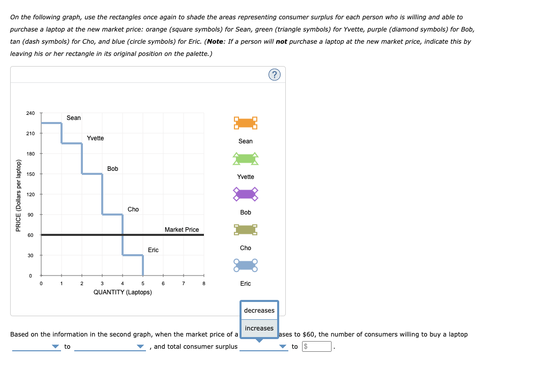
On the following graph, use the rectangles once again to shade the areas representing consumer surplus for each person who is willing and able to purchase a laptop at the new market price: orange (square symbols) for Sean, green (triangle symbols) for Yvette, purple (diamond symbols) for Bob, tan (dash symbols) for Cho, and blue (circle symbols) for Eric. (Note: If a person will not purchase a laptop at the new market price, indicate this by leaving his or her rectangle in its original position on the palette.) ? 240 Sean 210 Yvette Sean 180 Bob 150 Yvette PRICE (Dollars per laptop) 120 Cho 90 Bob Market Price 60 Eric Cho 30 0 0 1 2 3 6 8 Eric QUANTITY (Laptops) decreases Based on the information in the second graph, when the market price of a , and total consumer surplus increases Jases to $60, the number of consumers willing to buy a laptop to $ to